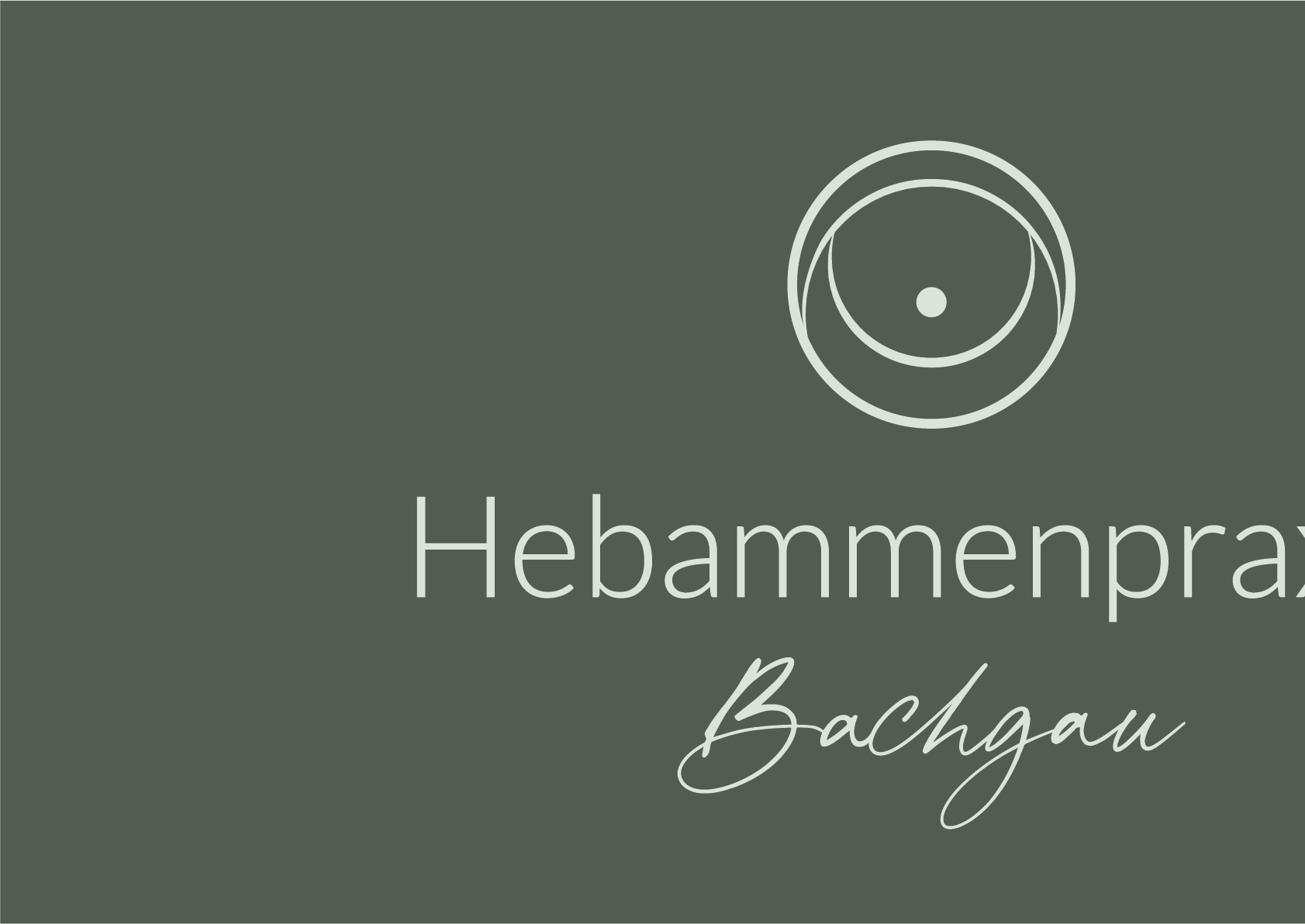
The Logo Design: Clear, calm and holistic. Uplifting and soft.
The logo on business cards
The Mood: Natural and welcoming.
Logodesign
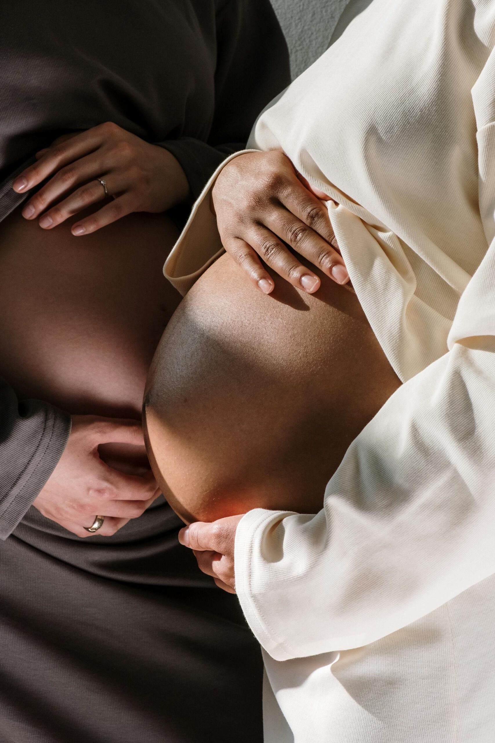
For the second time i had the pleasure to create a logo for Franziska Hitzinger and her new midwife practice. An upcoming safe space for (becoming) mothers and parents.
Her wish was a clear, simple and professional logo that still expresses harmony, and shows the background of her practice without being cheesy and too obvious.
So we created a clear line symbol that throughout its shape still connects wit the thought of community and support (the dot in the middle is being hold by the half circle underneath and protected by the half circle over it) and shows the holistic background of the practice (circle as a symbol for holism, community, wellness). The general expression through the uplifting inner circle is positive, welcoming and harmonic.
Also: it also resembles a breast or a bellybutton from the front and so plays in a beautiful way with the purpose of the practice.
Symbolic
Word mark
USED SOFTWARE
Adobe Illustrator
Thank you so much, dear Katharina! For the second time, you have met or even exceeded my expectations!
You responded to all my wishes, supplemented them with your creativity and thus made my personal midwife logo as well as the logo for the midwifery practice perfect! I also find it remarkable how you have developed in the three years or so between the two logos.
I thank you from the bottom of my heart that I can look at my logos happily every day. I highly recommend you!